Color
By Janet Parkhurst • 2 minute read
There is no better time to talk about color than fall in Maine! In the art glass world, we deal with color all the time. What a wonderful industry!
One of the tricks of the trade is knowing how to combine colors. There is a tool called the color wheel to help with this.
First, you have to “know your colors.”
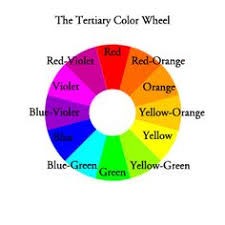
PRIMARY COLORS: The colors from which all others are made. These colors are Red, Yellow and Blue.
Red + Yellow = Orange
Yellow + Blue = Green
Blue + Red = Violet
INTERMEDIATE COLORS: The colors that result from mixing one primary and one secondary color. Red-Orange, Yellow-Green, Blue-Violet, Red-Violet, Yellow-Orange and Blue-Green.
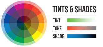
TINTS, TONES, SHADES: Made by adding White, Gray or Black.
In this industry, we talk about hot (or warm) and cool colors.
Yellow to Red-Violet are warm and Yellow-Green to Violet are cool.
Color harmonies are colors that go together. This is where the color wheel helps.
COMPLEMENTARY COLORS: They are opposite each other on the color wheel. They are one primary color and the secondary color that is created by mixing the other two primaries. The complementary color to Yellow would be Purple (mix of Blue and Red). If you mix these colors, you may get a muddy color or something on a grayscale. When put next to each other, they create a high contrast. They are a bit tricky to use. Use them when you want something to stand out.
TRIADIC HARMONY: Three colors spaced equally apart on the color wheel. These are three colors evenly spaced on the color wheel. They are also very vibrant. Balance them carefully. Let one dominate and the other two accent it.
SPLIT COMPLEMENTARY: A color and the two colors next to its complement on the wheel. This is a variation of the complementary. It is a strong look with high contrast but less so than the complementary. It is easier to use.
ANALOGOUS: Colors that are next to each other on the wheel. They match well and make for serene and comfortable designs. Good for nature scenes.
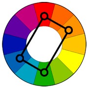
RECTANGLE (TETRADIC): Uses four colors arrange into two complementary pairs. This makes for a very rich color scheme. Watch for a balance between warm and cool colors.
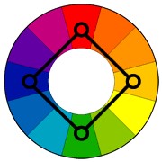
SQUARE: Much like the rectangle but with all the four colors evenly spaced around the wheel. This works best if one color dominates. Again, watch the warm and cool color balance.
